Tuesday, 22 March 2016

Magazine Spread

Hey there, firstly lets recap the main points of my last blog which says that I have chosen Vincent Van Gogh for my Museo magazine. Using colours blue, green and yellow give a perfect combination to the layout. And here how it looks like:


SPREAD


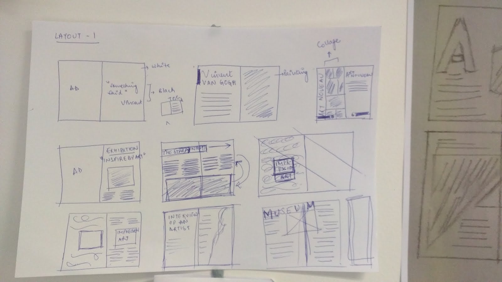
Now moving forward with the inside pages of magazine, I did mood boarding which has a few rough sketches of my magazine pages' layout. It's important to decide the colours, fonts, look and feel, images, deciding the content which has to be related to the cover page and the theme. 


PAGE 1

Then working on each page which starts from the AD which is on the inside front cover page.


It's about the Art Nouveau style interior designing company. The ad is quite related to the theme because of the Target audience of Museo magazine. So, the advertisement has to be related to the theme and there are more chances of the sale.


PAGE 2

Then the next page talks about Who said what? This section is always related to the theme. So here a quote by Vincent himself said related to painting. This page kind of motivates the reader and makes him/her understand about the importance of a particular theme. 

Also, its a good way to attract any reader.


I have kept this quote on a white page with black font colour because the minimalist style of designing is more effective than anything. It creates an impact by itself. The reader feels easy to read and due to breathing space, it becomes an effective and a powerful message. 


PAGE 1 & 2


PAGE 3


This is the 3rd page where it is covered by the Vincent's self portrait with his name. I have put a blue layer over it which highlights the name of the painter really well. And then the next page is on article of Vincent Van Gogh.


PAGE 4


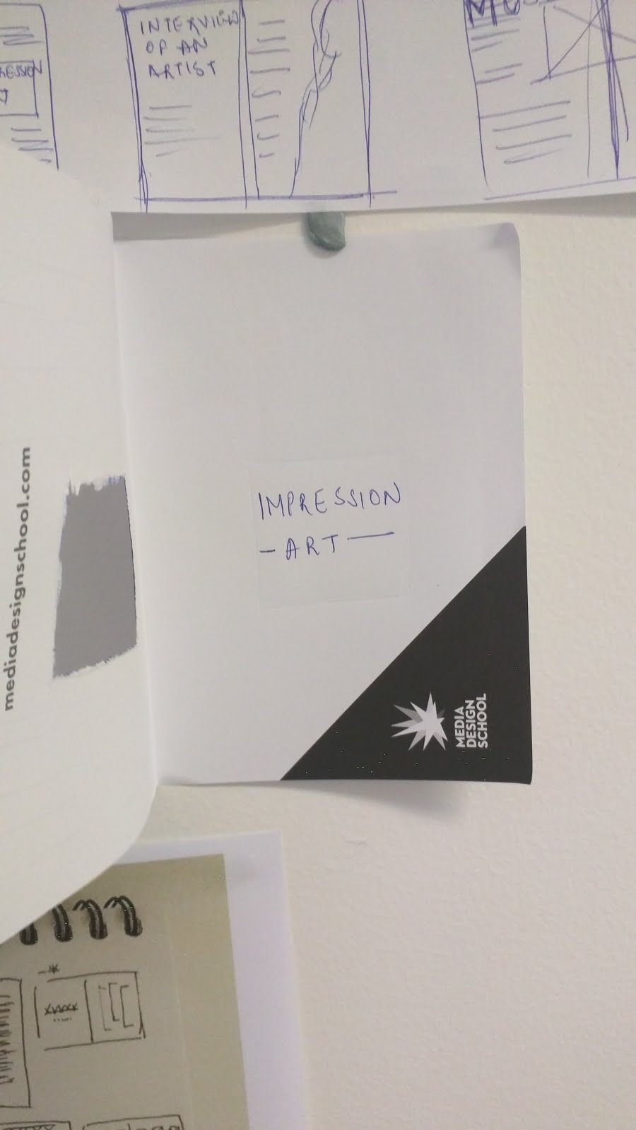
Table of Contents is very important element in any magazine. So here is Museo's table of contents. I have kept the entire page in black and white to make it read easily for the reader and more impactful. Also the flow of the contents reflect the Art Nouveau style. 


In my magazine I have talked about :


-Vincent Van Gogh
-What exactly is Art Nouveau.
-Vincent's paintings and his style of art which is "Van Gogh from Expressionism to Impressionism".
- Vincent's most popular painting "The Starry Night".
-Exhibition announcement and it's details.


                                                          PAGE 3 & 4


PAGE 5

This page is about the Vincent Van Gogh, an article by Shrutika Shedha. About his journey, achievements and art. It includes painting called "The Potato Eaters" because this painting was one of the famous paintings.  

The letter "V" starts from the painting which signifies the name's initial of the painter and a little bit of typography is also done. 


PAGE 6


Then this letter goes to the next page where the content of the topic is giving it a proper shape. 


PAGE 5&6


PAGE 7

Next page is an article on Art Nouveau, which explains about the heading itself. This picture at the background is a painting by Edward Okun. The name of the painting is We and the war.


PAGE 8


This is the same picture which continues to the next page.


PAGE 7&8


PAGE 9


This page again continues to have a little more explanation about Art Nouveau in Architecture. The article explains the style, design and the art in architecture. To make it more clear I have used an Art Nouveau architectural old building image where the style and the design is unique.  


PAGE 10


On the next page, I have put all the focus on the Impressionist art done by Vincent Van Gogh. I have used quite of his paintings to make the content more attractive for the readers. As you can see, there is a white box at the centre of the page, which is a cut-out in the square shape. The text written on the next to next page will be seen from here.


PAGE 9&10


PAGE 11


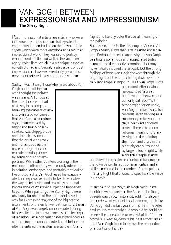
Next page is about the Vincent's work and style of art. "Van Gogh between Expressionism and Impressionism" is the article which means how Vincent used to get influenced by his dreams or the people and then he used to paint it in his own style of art.
At the centre, this box is the cut out of the previous which automatically is here as well so I have wrapped the text around the square shape so that my content doesn't get cut off.
Here the article talks about the paintings of Vincent.


PAGE 12


Alright, so here is the most famous painting called "The Starry Night". This painting is quite popular because he was inspired by his dream while he was hospitalized. He drew it and he actually became popular after this painting.


PAGE 11&12


PAGE 13


Coming at the end of the magazine, the exhibition announcement / invitation is important. I have mentioned the timing, venue, date, description of the exhibition, information about it and all the important elements which is required for any reader to understand.


PAGE 14


This is the collage of a few paintings from the exhibition. I have placed this to give an idea to the readers about the exhibition. And then highlighting the announcement clearly.


PAGE 13&14


PAGE 15


This is the 2nd advertisement and the last page of the magazine. The ad basically based upon the Art nouveau stylish pen. As its clearly seen that the ad is targeting to the high class people.


And this is the final mockup! Enjoy!!!


Things that I have learnt during this project:

-Understanding the theme or concept is a must.
-Message or idea should be conveyed properly through designs.
-Having a reason even for a single stroke is necessary. That’s what designers do.
-Follow one path or direction and dont follow all of them.
-Each layout should be clear and understandable.
-Understand your Target Group is really important.
-Keep trying.


That's it for now! Thanks for your time. Keep following!


Thursday, 3 March 2016


Initially, when we were briefed about our magazine cover theme, I thought it's going to be easy and quick, I would not take time at all. But I was pretty wrong.

On our 2nd week of Graduate Diploma in Creative Technologies in Media Design School (Auckland), we have to create a magazine cover which will be based on the brief given by our Professor Christoph Jannin (It's a french name and the pronunciation is jjjhhhhhannee). The brief was : 


Brief

Magazine Name : Museo 

It's Purpose : It promotes the fine arts in museum all around the world, exceptional exhibitions, focus on contemporary or historic international artists, artwork restoration, heritage conservation.

It's Theme : Special issue about Art Nouveau. To create on focused article about an artist.


Magazine Cover Specs: 

  • Full A4
  • Identifiable header / logo
  • Baseline
  • 3 article announcements ( exhibition, discipline, masterpiece)
  • 1 x highlight (the artist' article)
  • Code bar
  • Issue date
  • Price


Understanding Art Nouveau is a big thing in itself. And then to work on it, design something which compliments it or expresses it is a quite difficult task. Christoph explained the meaning of Art Nouveau and told us about many artists who invented Art Nouveau style painting, ceramics, glass work, furniture design. 

Art Nouveau is a style of decorative art, architecture, and design prominent in western Europe and the USA from about 1890 until the First World War and characterised by intricate linear designs and flowing curves based on natural forms. (Reference : https://www.google.co.nz/webhp?sourceid=chrome-instant&ion=1&espv=2&ie=UTF-8#q=what%20is%20art%20nouveau)


Research Process


I started researching on the next day about all the artists who belong to this invention and came out with many brilliant yet extra ordinary artists in this world. Alphonse Mucha, Gustav Klimt, Charles Rennie Mackintosh, Arthur Heygate Mackmurdo, Emile Galle, etc. 
It's difficult to pinpoint that whose work is better, who is good at what. 
So finally after a lot of research I was locked with Vincent Van Gogh (30 March 1853 – 29 July 1890), the famous Dutch post-impressionist painter in 19th century who had influenced 20th Century art after his death. He was virtually poor and unknown throughout his life and he had mental illness too.
His output includes portraits, self portraits, landscapes, still lives, olive trees and cypresses, wheat fields and sunflowers. Critics largely ignored his work until after his presumed suicide in 1890. His shortened life, highly expressive and spontaneous use of vivid colours, broad oil brushstrokes and emotive subject matter, mean he is recognisable both in the modern public imagination by his first name as the quintessential misunderstood genius and by art historians as a supreme and pivotal aestheticist. (Reference : https://en.wikipedia.org/wiki/Vincent_van_Gogh)


                                              A self portrait painted by Vincent Van Gogh


After the research, we were asked to do Mind Mapping. I believe that it's a great process to generate ideas and creating somethings which has got some meaning into it. Since I am Designer, I am supposed to have reasons or meaning behind every design, for that matter even it's a stroke or a line. 


Mind Mapping

So I did mind mapping which looks like:


Ya I know it looks horrible. But that's how I got an idea about how I am going to design my magazine cover. 


Mood Board :


I took 3-4 paintings of Vincent Van Gogh which includes one of his most famous painting "The Starry Night". During his last days of his life he had a dream and inspiring by that dream he painted "The Starry Night". Apart from this, I chose the following paintings which reflect the Vincent's work entirely. These paintings have beauty, serenity, imagination and of course all them are impression painting. 


                                                          "Self-Portrait" by Vincent Van Gogh


"The Starry Night" by Vincent Van Gogh


"Bedroom in Arles, 1888" by Vincent Van Gogh


"Starry Night in Rhone" by Vincent Van Gogh


  "The World of Truth" by Vincent Van Gogh


In my cover I wanted to take all his paintings and show a short story of his life, I wanted to maintain his Impression Art and influence people from his art. Vincent Van Gogh is slightly different from other artists of Art Nouveau because of his style of work. When I started designing I made this: 

Layout 1


And it was a BIG NO NO!! 

After several tries I reached to the Double Exposure concept where I could take 2-3 paintings of him and create it. Which looks like this : 

Layout 2


I know it's still looking worst but the work is in progress and I think I will come out with something good.

Colours :  Choosing colours is a difficult task because every colour says something or expresses some feelings. The colours that I will go are Blue, Green and Yellow not because I love these colours but the reason being is that these 3 colours are mostly used by Vincent Van Gogh. 

Font :  I suppose that according to the magazine theme the Font style has to be sleek, classy yet compliments the entire cover layout. Choosing the fancy, stylish, decorative font style could be dangerous for my entire layout. Sans Serif is the option that I would choose for my Title and the subheading. And the same will be followed by rest of the content. 


Final Museo Magazine Layout Process

After working on the layout, I came up with this : 


I think this looks good enough. Apparently, Christoph asked to create 2-3 more options with different layouts and not stick to only one layout. I agreed!

The other styles that I chose was Typography and the other one is a simple editing with his painting at the background and his self-portrait painting at the front.

Those layouts are as below : 


This layout took time as the Vincent Van Gogh' face is made up of sketch and his paintings' names. After completing this layout, it looked more of like a news magazine because of too much content over it. I liked the layout but was not correct for an Art Magazine. 

Hence, I chose my first option only.  


After putting all the content over it, using Roboto Thin and Bebas Nueue fonts, the layout pretty much compliments the Art Nouveau theme. If you look at the title, the letter 'E' is inverted. The reason being is that Vincent Van Gogh was different from other Art Nouveau artists in terms of art style, work & thinking. To represent that I inverted the 'E' letter. 

Apart from this, I placed the most important article of the magazine i.e Vincent Van Gogh at the top, just below of the subheading. I wanted readers to read this first. Then comes the announcements which I placed at the bottom, where reader could go through it one by one. 

And that's how I finalised my Museo Magazine.


THANKS!